Out of classical thought came the idea that beauty lies in proportion, for without proportion, there is only chaos. Nested in that idea is longing for symmetry. Whether it’s flowers, furniture, or faces, the more symmetrical an object is, the more the human eye perceives beauty. Home architecture is no exception.
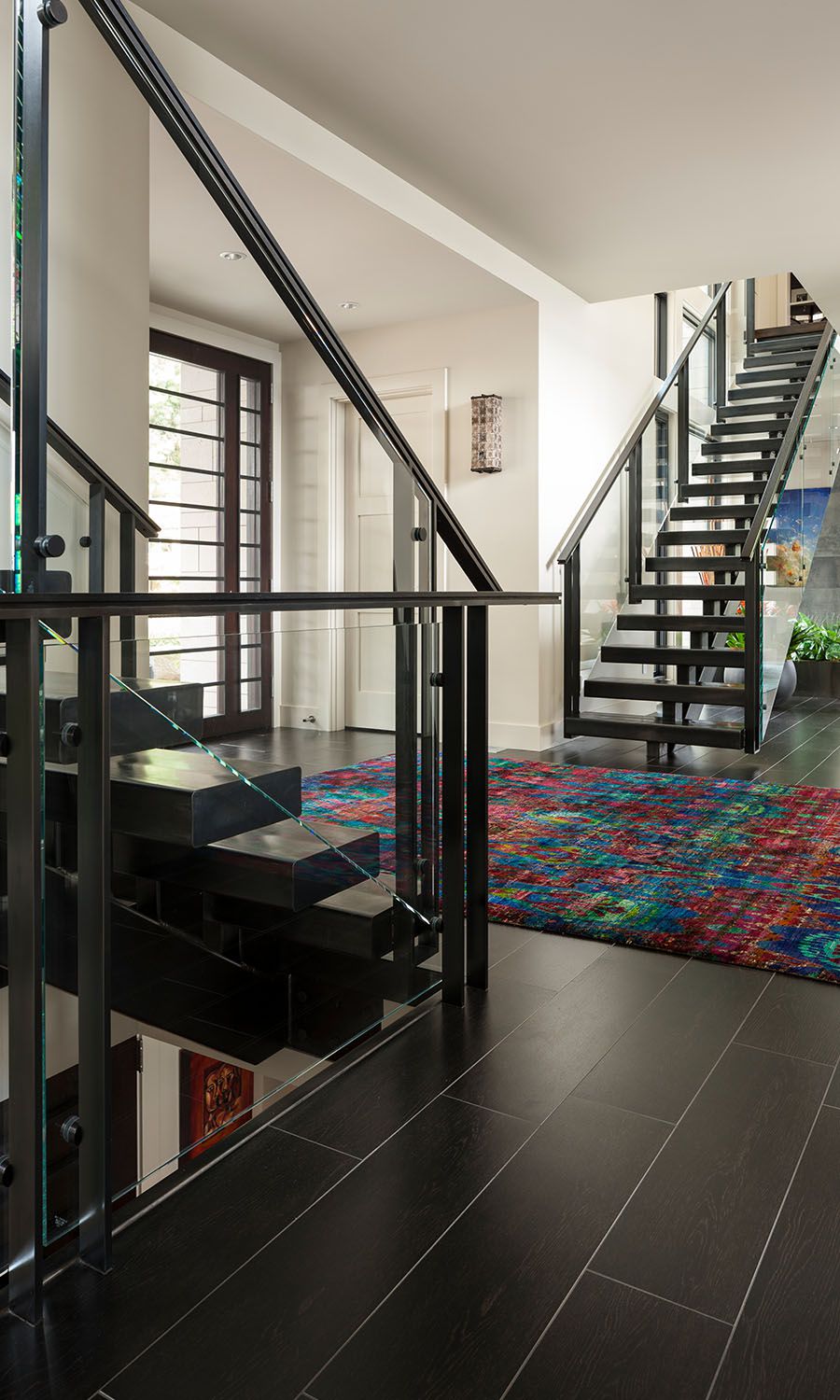
When it comes to custom home architecture, great architects consistently seek symmetry, balance, and proportion in their designs. For instance, Bellevue architect Scott Hommas infused proportion into a Meydenbauer home with symmetrical staircases in the main entry. The opposing staircases bring a sculptural elegance to the foyer and frame the view to the living room and the waterfront vista beyond.

Of course, the sculptural staircases enhance the function (as well as the form) of the Seattle custom home. One staircase rises directly into the children’s wing, while the other ascends to the master suite area.
Asymmetrical Symmetry
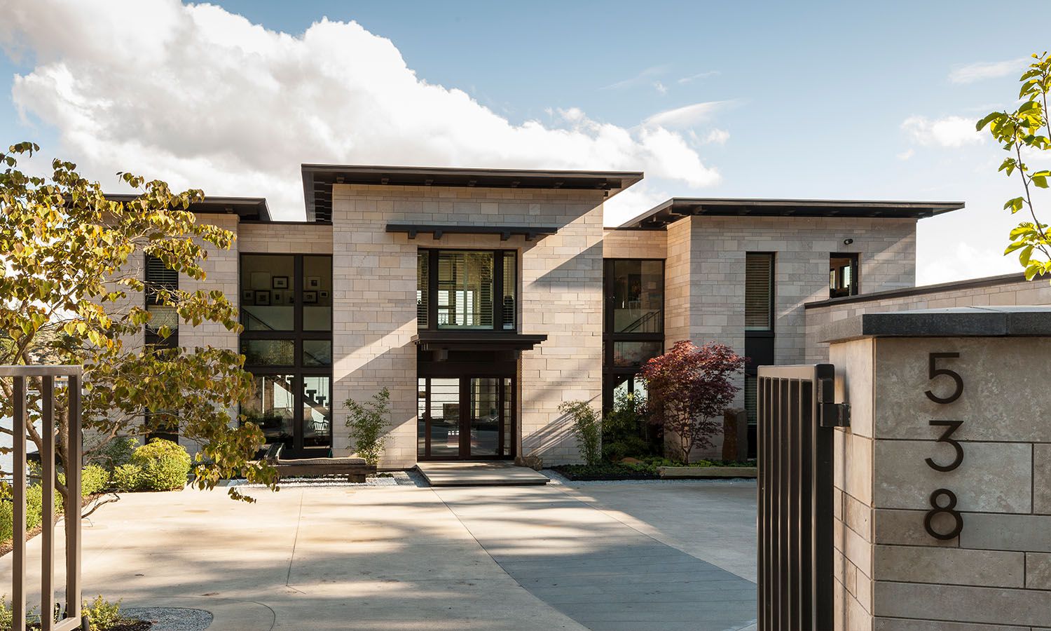
But perfect symmetry isn’t always attainable. Space restrictions, zoning laws, and natural landscape sometimes prevent the Meydenbauer home’s exterior symmetry from unfolding with ease. But with some creative planning, the illusion of symmetry is possible.

Scott explained that the slope (among other considerations) of the Meydenbauer lot limited the custom home’s exterior symmetry. Yet the home architecture still stands beautifully balanced. He began with the center of the exterior and created solid, even lines. The elevated roofline flanked by two lower, but mutually even roofs draws the eye to the stately middle and offsets the fact that one wing is wider than the other. Clear lines in the stone walls and metal accents provide a clean, consistent aesthetic. Dramatic columns of windows further balance the exterior while inviting light to pour inside.
Beauty is possible in almost any space, so long as the right creative strategy is in place. What’s more, it’s an opportunity to use our art—the art of architecture—to bring your dream home to fruition, despite apparent obstacles. Scott harnessed Meydenbauer Place’s asymmetrical design to craft a beautifully balanced modern home.