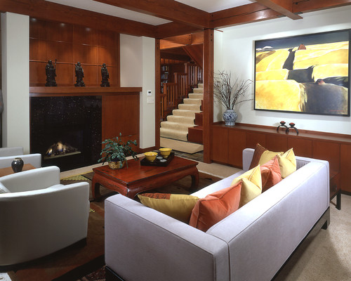
Each Gelotte Hommas custom home offers a story, and our architects are meticulous in remaining faithful to the established stories and themes of each project. Shoreline architect Scott Hommas recently discussed his process for designing a timeless, Pacific Northwest house with an East Asian motif.
How did the Asian Ambiance project come to you and what’s the story?
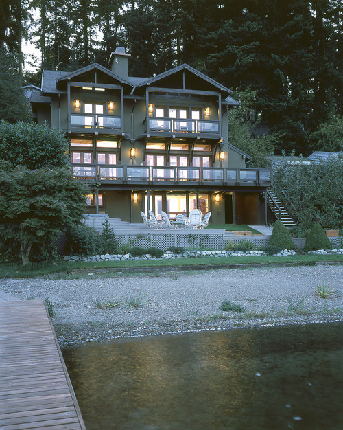
This project is actually an older project, but it’s timeless. It’s as modern today as it was when we designed it, right around the year 2000. The project was a remodel–one of those homes that at the genesis of it was a one story shack on the water. We had to determine how it all stood up. There was a deck that wasn’t even attached to the house; it was just leaning up against it!
By the time we got to it, it was a two story shack. The house’s structure was fine. Some of the things attached to it weren’t great, but we worked very hard to maintain the home’s original geometry. We took the roof off and added a third floor with a bedroom, a large office, and a media room.
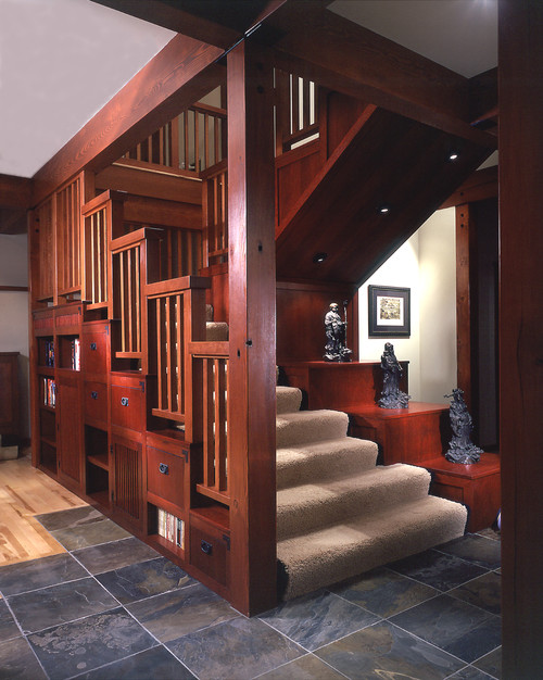
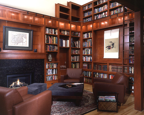
Then the fun thing about this house is the stairwell. We wrestled with, “How do you get the main entry–which is on the upper floor–to graciously bring people down to the main floor? So we created a stairway that is more like a piece of furniture than a stairway. The owner had an interest Asian art, so this custom stairway is designed after an Asian tansu hutch. We followed through on that Asian theme and created a cozy library sitting area.
The owner approached you with the Asian art theme. Was the East Asian architecture style familiar to you, or did you have to do a bit of research to achieve it?
Asian and craftsman style are kindred spirits. The craftsman style movement was largely influenced by Asian design, so I think I was very familiar with the concept and the overall design philosophy. It wasn’t too much of a stretch for me. And it was fun! It was the first project I worked on that had budget enough to execute details like that stairwell.
Talk more about the evolution of the staircase.
It was a question of how do you make it gracious, how do you make it meld well with the library down below, and how do you use every inch of space in the house? It’s actually not a large house. And it all fell together. It felt natural: the tansu hutch idea and using every bit of storage possible. Making it look like furniture instead of a stairway. It felt like it evolved naturally, with very little effort. I spent a lot of time detailing it out, but I think it turned out well.
What challenges did you face in crafting this home?
The lighting. You start putting a lot of wood into the home along with the muted colors, and, especially in the Pacific Northwest, it can quickly start to get dark. We focused on lighting the displays and lighting the ceilings to make sure that the home stayed bright. I think we did a good job. We were working with some low ceilings and a lot of dark wood, yet it still feels like a light, bright space.
What’s your favorite part of this craftsman style house, and what did enjoy most about designing it?
The owners really did have an appreciation for good design, and they allowed me to foster that. One of the most successful things in this house is the library. It’s a warm, cozy place, and it’s timeless. I think the owners appreciate all the little details that went into it. It’s an example of how a house can have a waterfront view, but it can offer other things, too. It doesn’t have to be all about the water. Although, we didn’t lose any opportunity to take advantage of it on the other rooms!
Closing Thoughts
As a Shorline architect, Scott’s thoughtful design efforts on this custom project reflect the care we take with each client’s dream home. Our clients’ interests, preferences, and lifestyles are our primary inspiration for crafting timeless, welcoming homes.


